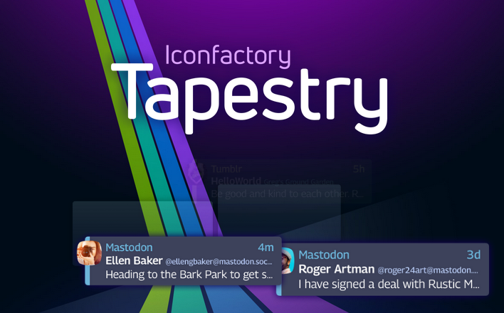
Reviewing Iconfactory's Tapestry
A quick overview of the Tapestry app for iOS.
I’m not paid to review anything, ever. Just genuinely enjoy things that I find and want to share them!
If you read my other post about RSS feeds, you’ll know I really dig that technology. My preferred websites, blogs, posts and more in one curated timeline without distractions. Then, I learned about the newly released iOS app Tapestry from Iconfactory.
Here is excerpts from Iconfactory’s blog:
After a successful Kickstarter campaign, and ten months of development, Tapestry is finally an App Store reality.
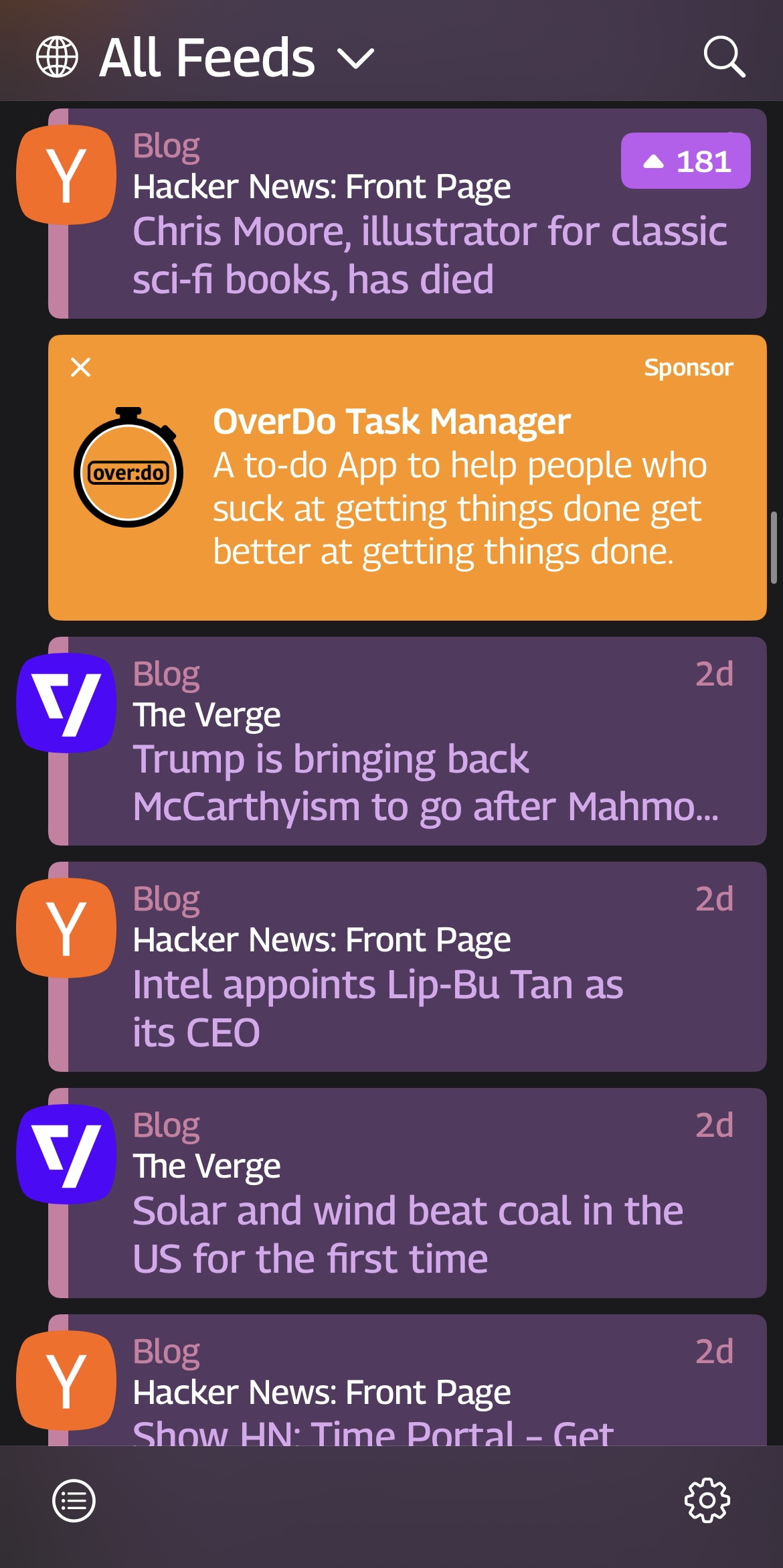
Tapestry presents content in chronological order, with no algorithm or other person deciding what you should or shouldn’t see. Content can come from social media services like Bluesky, Mastodon, or Tumblr, as well as RSS feeds, podcasts, YouTube channels, and others. All in the palm of your hand with no tracking.
A Unique Approach to Ads
We hate internet advertising and so do you.
That’s why we made our own ad network for Twitterrific. With Tapestry, we’ve taken what we learned there and improved it for the better.
We’ve worked hard to craft ads that are harmonious, visually appealing, and for things you might want to see or use. But most importantly, we have done all this with your privacy in mind: there is no tracking and there never will be.
Honestly, this was mind-blowing to me once I downloaded and saw the app in action. Gorgeous visual design, tons of customization, privacy-focused, and with limited ads. Oh, let’s talk about the ads more, because this was fascinating to me.
If you know me, you know that I am very hostile toward ads. I won’t use an app or website or browser if it means I cannot block ads. I set up a Pi-Hole to block ads network-wide in my household. Chrome is off the table entirely since they removed support for adblockers like uBlock Origin.
Tapestry’s ads integrate very well into the app itself, visually and congruently. They suggest things I actually would like without knowing all of my personal details.
 Tapestry timeline
I downloaded this ToDo app, among others from similarly small developers, and it’s cool. Simple but not too generic, and as someone who is extremely forgetful, it helps a little bit to see my tasks all laid out and mark them off. It does not interrupt the flow of my browsing within the app either. No flashing animations or grotesque weight-loss supplement shilling. To be fair, the technology theme of most of the apps fits well into my niche as someone who would review this app in the first place as well.
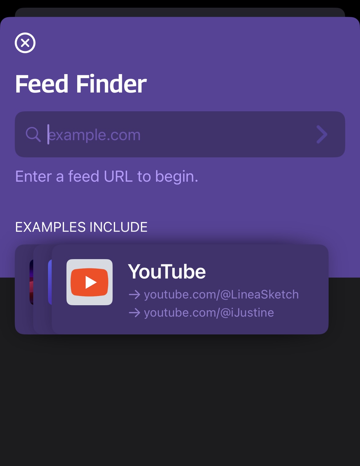
Let’s take a deeper look at the app. You can add “connectors,” like YouTube channels, Bluesky profiles, subreddits, and more. You can add RSS links directly for websites and blogs.
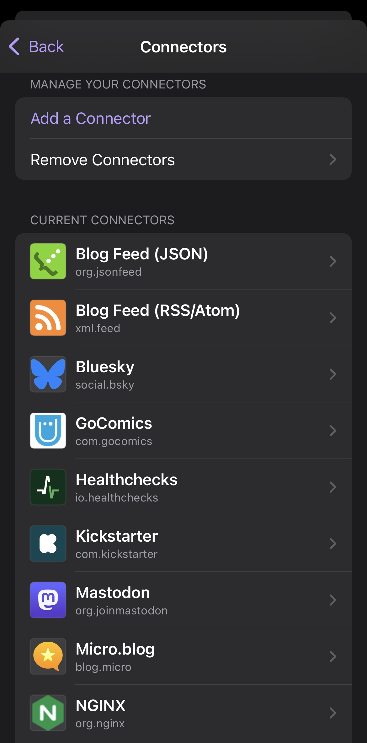 Tapestry connectors
Enter a feed URL and it will find the feed file for you.
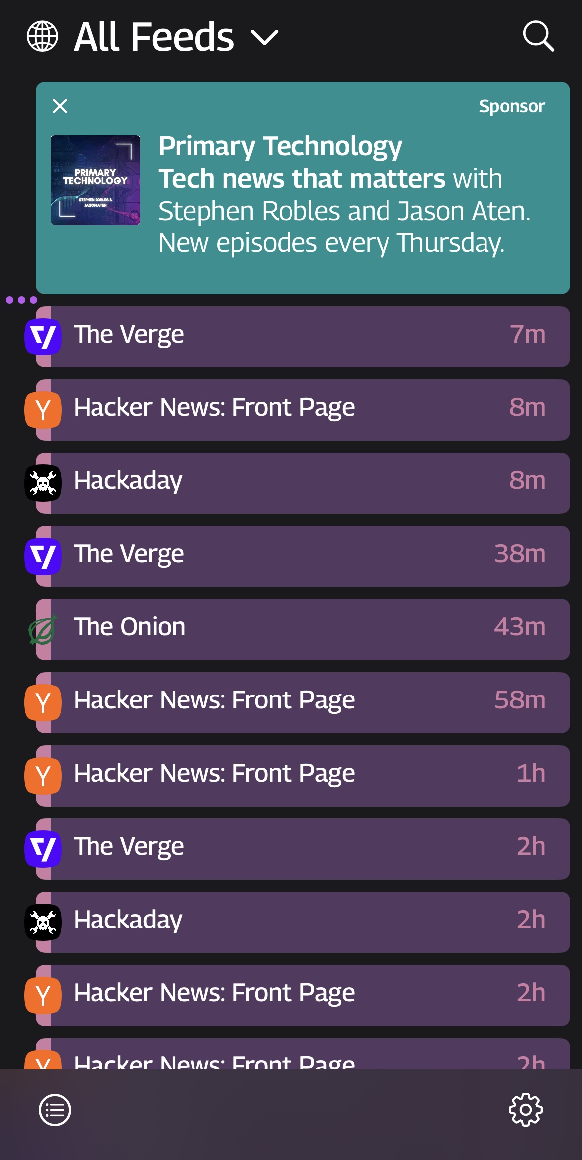
 Tapestry timeline
On the main tapestry timeline, you can sort by feed or create personal timelines for different viewing moods. See ones that are new for that day, and ones you’ve marked to read later or otherwise reference.
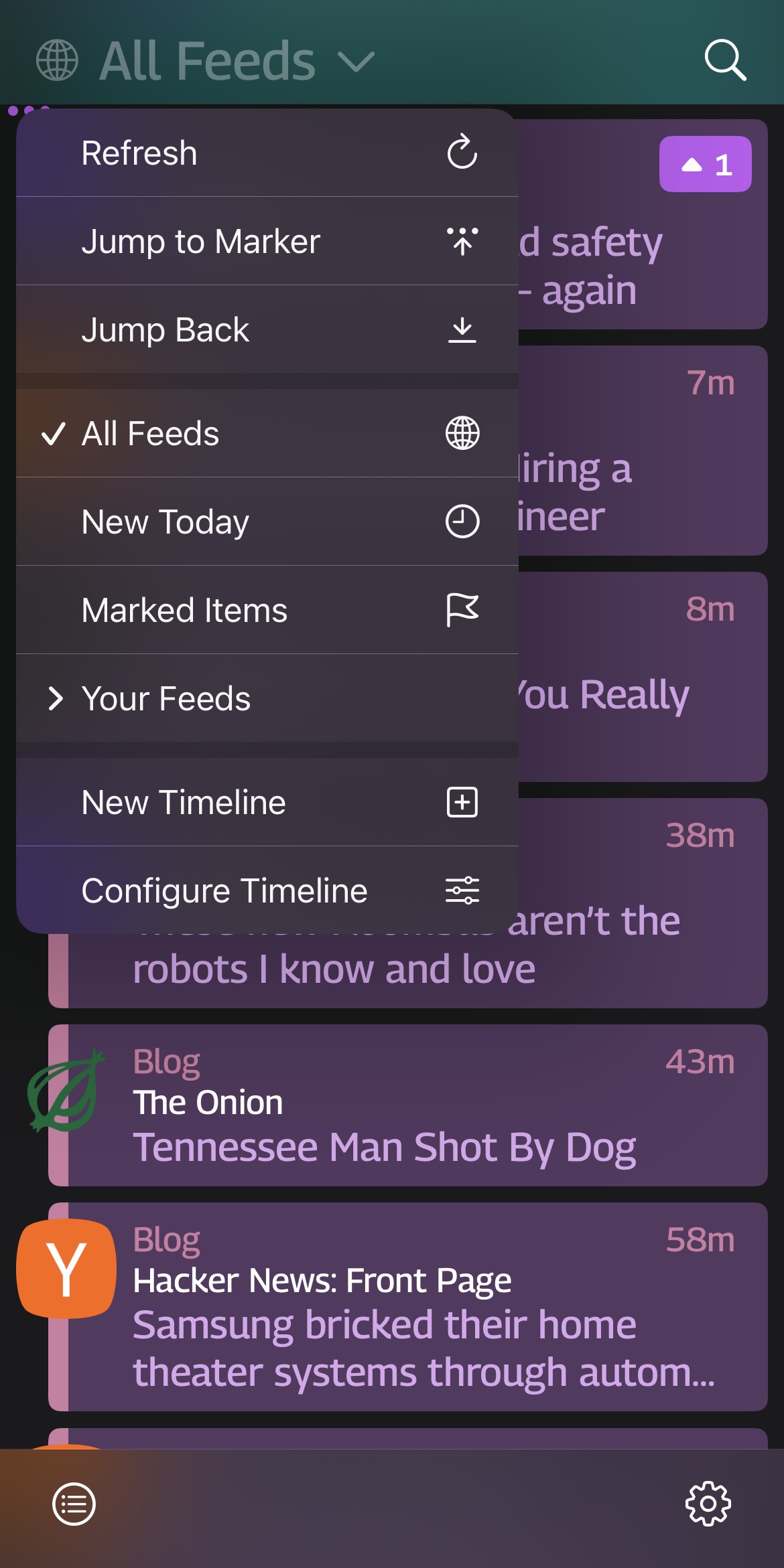 Tapestry timeline options
And finally, change how your feed items appear. I use the collapsed view, but there is also mini-
 Tapestry mini timeline
-and expanded, to see more in-depth content while scrolling.
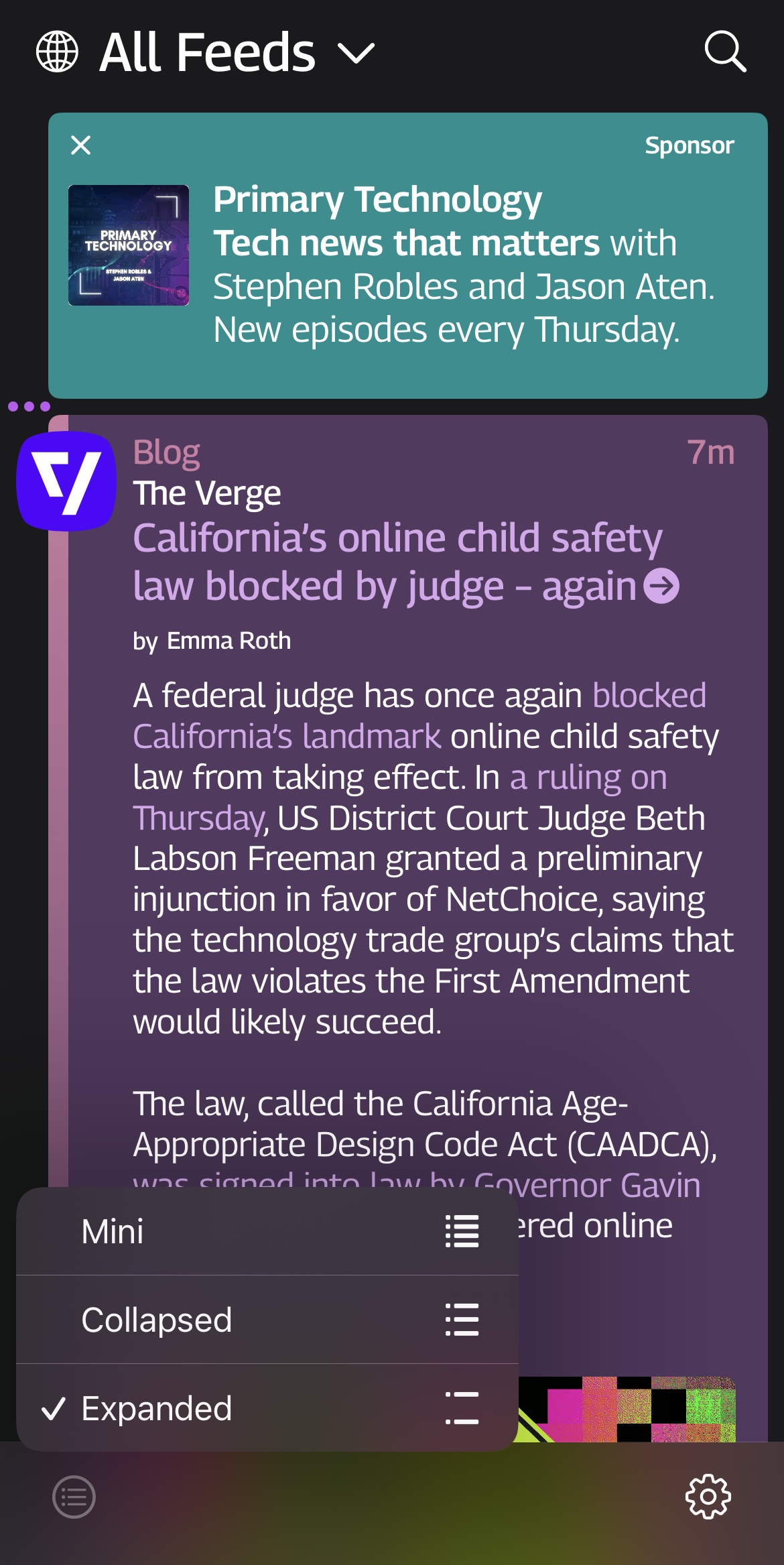 Tapestry expanded timeline
I like the collapsed view the most because I can see what the item is about, a quick blurb, and tap on it to expand it further if I want to take a closer look. Then I can tap on the article viewer or the link itself to read the whole thing. Lastly, I like the color-coding of some items because it tickles my brain, but I think on the free version it only has some color-customization options.
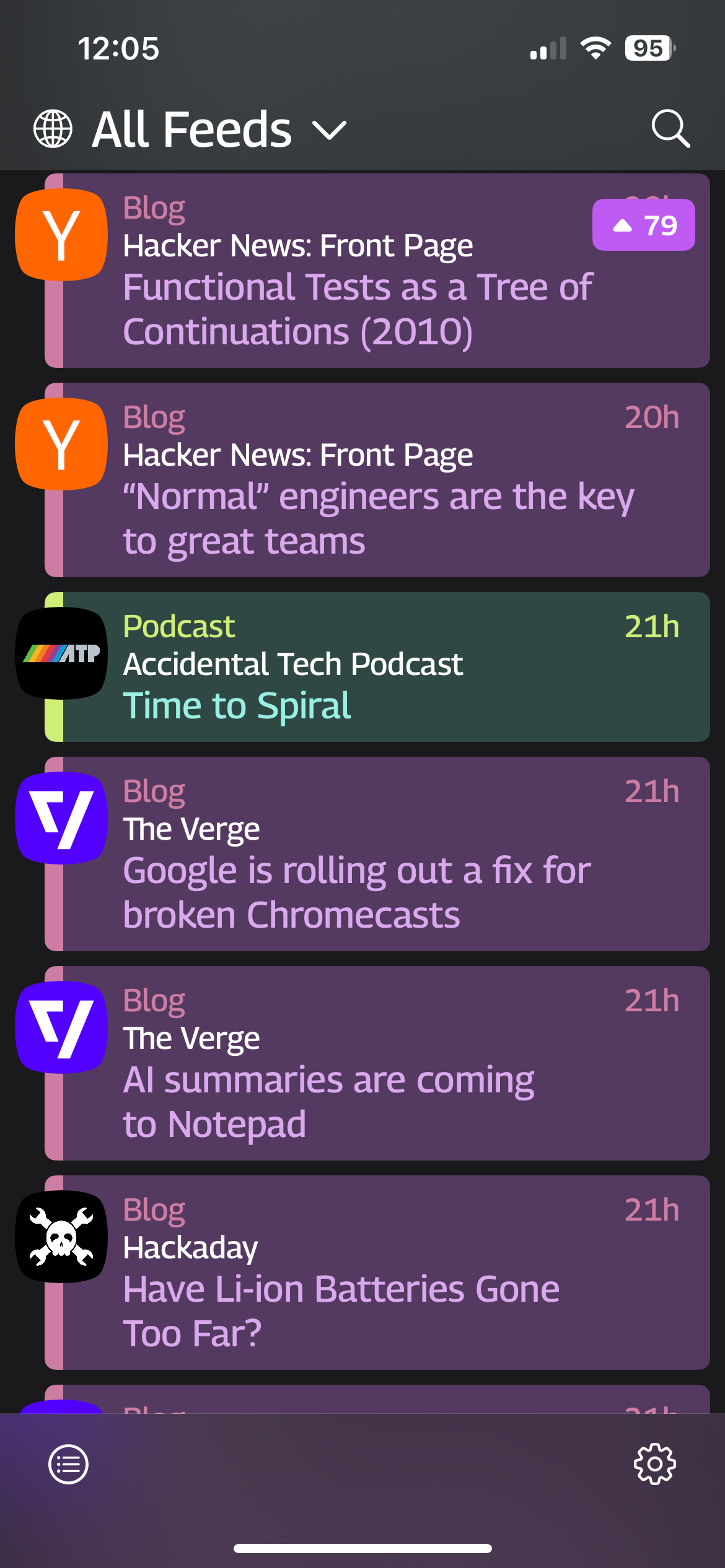 The podcast item is colored green compared to the surrounding purple ones
I suggest that if you have an iOS device to explore it. Curate your perfect feed. Support the developers. Get only content that you want.